Primarily, I work with colleges and universities to restructure their websites for the best user experience. A visit to a college’s website should provide a prospective student—whether still in high school or an older adult—with a perspective that allows them to feel, “I belong here, I want to go here,” “This place will be good for me.” I am brought in to website redesign projects to restructure, realign, force the marketing and enrollment priorities to the forefront, and to bring a new perspective to an institution that has “done it that way” for years.
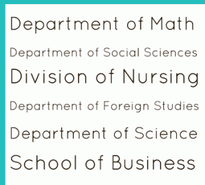
I’m amazed to still find that some academic websites are presenting their schools based on their org chart. Within certain parameters, these institutions all have similar organizational structures: there’s the president’s office, the provost’s office, the registrar, residential life, the library, and all the various departments that bring students to the school in the first place.
So why organize your website based on your internal departmental structure and hierarchies when what students are really coming to your institution for are the degree programs, the student experience, and the community? These are the user experiences that make your institution unique and contain your strongest sales pitch—it is your institution’s story, so use them.
Consider the printed view book that is mailed to prospective students. The best ones I’ve seen tell the success stories of the institution and the possible pathways prospective students can take to be successful themselves. They are laden with descriptive photographs of campus, smiling students in new and modern facilities working directly with faculty, participating in theater, spiritual or sporting events, and it is obvious to the reader that the students are enjoying their campus experiences.
Providing an optimal user experience means telling your school’s story: your alumnus’s successes, professors research awards, the campus’ unique qualities. Give the prospective student an easy entry point to apply, to connect with an admissions counselor and ask questions about your school. Make tuition, fees and financial aid easy to find and use a cost calculator. Keep text to a minimum and make it easy to scan lists rather than large blocks of content. Give them lots of photos, and engage them through social media. Present all the programs your school offers in an easily readable list. And build it on a site architecture that can grow to accommodate the changing times.
